How Much Climate Change Mitigation Action Would Result From Efforts Comparable to Canadian Provinces’ Climate Targets?
Earlier today, I presented at the 2015 Annual Conference of the Environmental Studies Association of Canada, as part of Congress 2015 in Ottawa. Here are the slides of my presentation and below is a slightly edited version of the talk I had prepared. The presentation was entitled “Do Unto Others… How Much Climate Change Mitigation Action Would Result From Efforts Comparable to Canadian Provinces’ Climate Targets?”, and here you go.
What I am going to talk about today, is to look at climate mitigation targets of Canadian provinces and how much mitigation we’d get if other provinces or countries would match them. I am doing this by thinking about a province’s target not in relation to some historical base year, as we usually do, but in relation to what can be said to be that province’s F-A-I-R S-H-A-R-E of the overall global effort to address the climate crisis.
In order to do that I will first provide some brief background on the Climate Equity Reference Framework that I’ll be using. Then we’ll look into some specific (and partially surprising!) results that we get when applying an equity framework to the question of comparing provinces’ mitigation targets. Before closing, I will offer some thoughts of what we can take away from this.
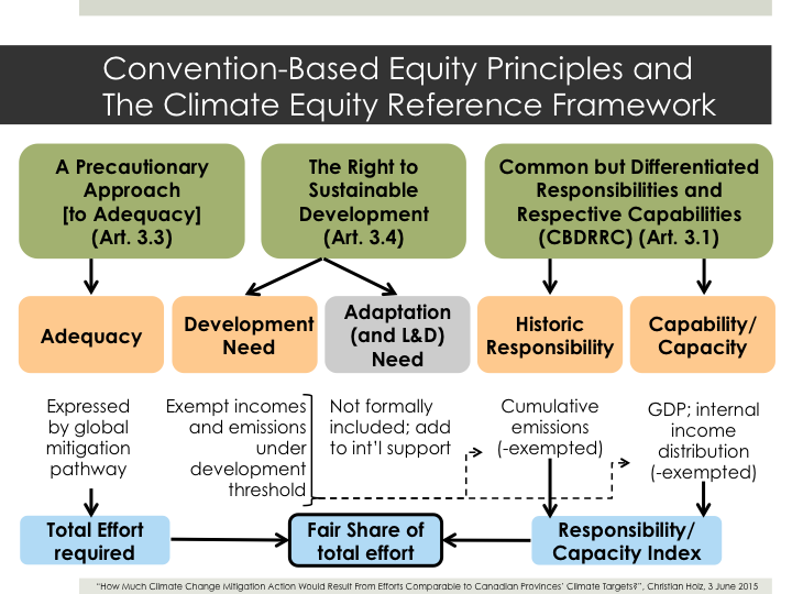
Don’t worry, I won’t be covering all of this. This schematic is just to demonstrate how the Climate Equity Reference Framework starts off from the equity principles that are explicit and implicit in the UN climate convention and constructs from there a methodology that can calculate for each country (or in my case: for each provinces) FAIR SHARES of the overall global effort needed to address the climate crisis.
For this presentation we don’t really need to know how this works in detail, but I am happy (in fact, delighted) to explain more afterwards.
In the end, part of the size of each fair share is determined by HISTORICAL RESPONSIBILITY for creating the climate crisis and the other part by the level of CAPACITY for solving it. Today, only capacity is of interest to us.
The notion of capacity relates to the notion that it can be said to be fair to expect countries to do more if they have more money – in other words, a higher GDP.
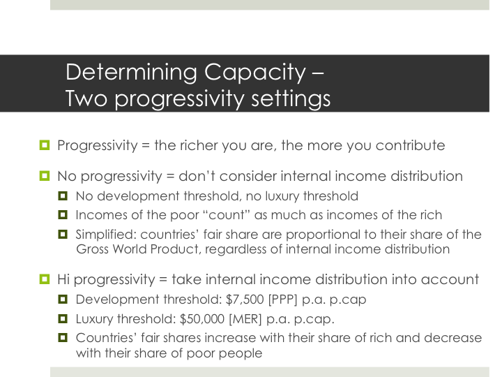
However, we can argue that GDP is only half of the picture and we need to also take internal income distribution into account when determining countries’ (or provinces’) capacity to mobilize means to fight climate change. And this is where PROGRESSIVITY comes into play. Essentially, progressivity means that the richer you are, the more you are expected to pay towards things like roads, health care, education, or in our case, addressing the climate crisis.
When thinking about a country’s capacity, we have to think about progressivity because we cannot reasonably expect to mobilize the incomes of the very poor for climate action because those incomes are needed to lift people out of poverty etc.
In the analysis here, I will be contrasting two specific cases: no progressivity and high progressivity. In the no progressivity case, internal income distribution is ignored, or in other words, every singly dollar of income is counted towards that country’s capacity regardless whether that dollar is earned by somebody who makes one dollar a day or ten thousand. In other words, if we estimate the global cost of climate action to be, for example, 1% of GWP, every country would have to contribute 1% of its GDP to climate action.
In contrast, the high progressivity case that I use here, has a “development threshold” below which we do not count incomes towards capacity as they are associated with poverty eradication and such. Only income above that threshold DOES count, and how much it counts slowly increases up to the “luxury threshold” above which all income is counted toward the country’s capacity. So this scenario DOES take internal income distribution into account and a country with more poor and less rich people will, as a result, have a smaller fair share than one with more rich and less poor people.
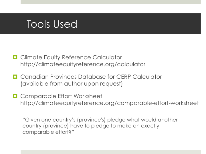
After this bit of background, we can now look at results. In order to get those, I have been using the Climate Equity Reference Calculator, which is an easy to use online tool, where users can explore their own preferred parameterizations of equity.
I am using the calculator with a custom database where I replaced Canada data with provincial data to look at provinces in the context of global mitigation.
For this analysis today I am also using the Comparable Effort Worksheet, which is an interactive tool that I developed to leverage output from the Calculator to compare the pledges that countries are making in advance of the Paris climate summit later this year. Again, this is available online and users can explore the different equity parameterizations.
The comparable effort worksheet essentially is answering the question
“Given one country’s (or province’s) pledge what would another country (or province) have to pledge to make an exactly comparable effort?”
… this can be answered be expressing the first country’s or province’s pledge as a fraction of what its fair share should be and then applying that same fraction to the fair share of the other country.
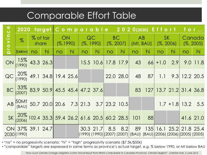
Alright, so let’s look at this in practice. Here, in the table I have a subset of provinces that have stated a 2020 target.
These data allow for interprovincial comparison of targets, so let’s do that, starting with Ontario’s 2020 target – 15% below 1990 levels. Now these next two columns show us, what percentage of Ontario’s FAIR SHARE this target represents under each of our equity scenarios – no progressivity and hi progressivity.
Two things jump out on us.
- First, the share is higher in the no progressivity case. This is one of the interesting things to note and is like this all across the board in rich countries. The reason is, that in a no progressivity case, where the income of the poorest are utilized just as much as the income of the rich, poorer countries have to bear comparatively larger share of the overall effort than in the hi progressivity case, and as a result, richer countries get away with less.
- The other thing stand jumps out is that in both of these scenarios, Ontario falls waaaaay short of its fair share. This is because of a feature of the framework that I haven’t mentioned yet, which is that this approach explicitly refuses to be biased by realpolitik-driven questions of how much mitigation can “realistically” be undertaken within a country.
As a result, for rich countries, we get fair shares that typically far exceed their mitigation potential, which means that some of the mitigation that this country is responsible for has to be carried out in other places through international cooperation.
So in order to bring it’s target in line with its fair share, Ontario would have to ensure that emissions equivalent to roughly another 1 to 3 times of what it indents to do at home, is done in other countries through international cooperation.
But for comparing provinces with each other we can ignore this part for now.
Alright, so let’s look across the table to compare other places with Ontario.
- In order for Quebec here to be as ambitious as Ontario, it would have to be taking a 15% or 10% target, which makes sense intuitively – the 15% is pretty much an exact match of Ontario’s target in a no progressivity case, and when we take into account differences in internal income distribution, as the hi progressivity case does, Quebec doesn’t have to stem as big of a contribution as Ontario since Quebec has more people below the poverty threshold and less above the luxury threshold.
- As we move further across the table, we notice another very interesting thing, perhaps somewhat unexpected: in pretty much every case, the target that a province (and Canada as a whole) would have to take to match Ontario’s ambition is SMALLER than the target they actually proposed, which helps us identify Ontario’s target as one of the weakest.
Ok, let’s look at another few interesting things here. I should point out BC’s target and the fact that it is the highest share (with the partial exception of Saskatchewan, which I’ll get to in a moment) of its fair share, in both progressivity scenarios.
This is a conclusion that we couldn’t have reached just by comparing the percentages (mainly because of the different base years involved).
There are two reasons for that. One is that the BC target really is comparatively good, but the other one, importantly is that this effort sharing framework conceptualizes effort viz-a-viz baselines, and in this case a some of the GHG implications of the Clark government’s natural gas aspirations are included, so the effort of reaching the 33% target is measured against that, upward pointing, baseline.
There is much more interesting stuff in here, but the one last I want to point out is the 102% for Saskatchewan.
This essentially means that Saskatchewan’s target is so ambitious that it actually proposes to do MORE than its fair share. I said earlier, that this approach can be used to identify leaders and laggards, so here we have our leader, right? Well, it depends how you think about equity – if you compare the high and no progressivity cases, you see that Saskatchewan’s figure actually is pretty much in the middle of the field if progressivity is taken into account.
So only in the context of a global effort-sharing regime in which the world’s poor are expected to do what I would consider to be an unreasonably and unfairly large share of the effort, would Saskatchewan qualify as a leader.
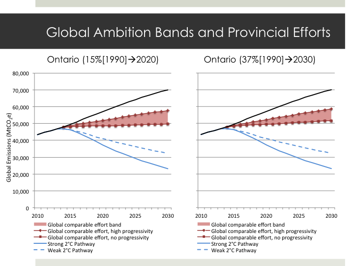
Ok, so now let’s look at some other way we can think about analyzing provincial targets under an effort sharing regime. Instead of asking, as we have thus far, “what if other PROVINCES would match a provincial target?” we can ask what if ALL other COUNTRIES would match that target. Then we would get a corresponding global ambition level, which, in turn, we can compare, for example, with a 2°C compatible global trajectory.
This is what these graphs do, with Ontario’s 2020 target on the left and its 2030 target on the right. In the chart, we have global business as usual projections in black and in blue two reductions trajectories for less than 2°C warming. The red wedge is the “global comparable effort band” that shows how much global effort we’d get if countries would match Ontario in a high progressivity (at the top) or no progressivity (bottom) effort sharing regime.
Clearly, this is by far not enough to stop warming below 2°C. Interestingly, if we compare these two, we see that the 2030 target has even slightly less global ambition than the 2020 target, so in terms of thinking of targets as fractions of a FAIR SHARE, Ontario has actually been LOWERING its ambitions with its brand new target.
The other thing, and I mentioned this before, is what that means for our 2°C trajectory. It could mean that Ontario has to go deeper at home or it could mean that more mitigation has to happen elsewhere – and here the crunch question is whether we expect other places to do more than their fair share, or, whether Ontario embraces its fair share and finances further mitigation abroad. The right answer is probably a combination of doing more at home and investing in mitigation abroad.
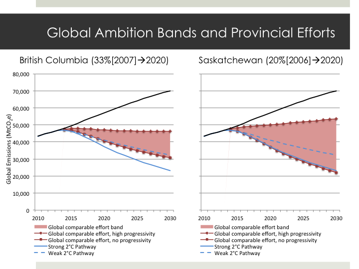
Here are two more of those, and here I want to focus on Saskatchewan again. We can see again that it actually is plausible to say that Saskatchewan’s target is compatible with a stringent global mitigation pathway, but only if seen in the context of a hardly defensible equity setting. [You can’t see it from the graph but there is another factor at play here and that is Saskatchewan’s extremely high per capita emissions – in fact, if Saskatchewan were a country it would have the highest per capita emissions in the world. So mitigation in Saskatchewan always implies relatively high per capita emissions reductions, which, if matched everywhere, would lead to quite some serious global mitigation.]
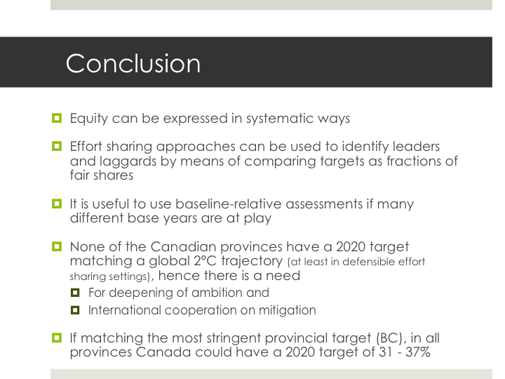
To conclude, what I hope I could demonstrate here, is that equity in climate mitigation can be systematically operationalized and be usefully applied to assess targets and pledges. Specifically, we can use effort sharing approaches to compare climate targets across entities, by thinking of them as fractions of those entities’ fair share, in other words, how much of what those entities SHOULD be doing are they proposing to ACTUALLY do?
This can then be used to identify laggards and leaders, which, importantly, is even true if different base years are in play in the comparison.
Looking specifically at Canadian provinces we can see that none of the provinces that I considered here has a target that is compatible with a global 2°C trajectory so we need to see a deepening of those targets and, since rich countries typically cannot discharge all of their fair share domestically, a serious investment in helping other countries get on a low or zero carbon development pathway.
Finally, we can see that if all provinces would match the most stringent target, their efforts would be substantially deepened – so much so that Canada as a whole could double its 2020 target.